There are many nice new corporate designs popping out everywhere that are minimal, efficient and perfect examples for good balance. Riding this wave of clean and minimalistic design I had the pleasure to work with the 100und1 office in Vienna on a lot of beautiful designs in that very spirit.
But when I got the offer to relaunch the CI of one of Vienna's finest Hostels, that exists since over 40 years we had to leave this path entirely. This was mainly due to the unique character of the Business, that is run like a Family Business and expresses a certain disconnection from the new slick corporate world of highly optimized travel experience - retaining a warm, homely feel.
We wanted a logo that could be all that: Warm, unique, artful and not perfect at all. After soem more humorous attempts we gathered that we could not just appeal to the younger, partying travel crowd. With many private Rooms and a Family friendly service the guest of Hostel Ruthensteiner are a colourful bunch, a mixture coming from everywhere and not jsut geographically.
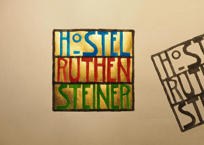
After trying many approaches we took another long look at the Hostel: with lot's of art on the walls that feels somewhat inspired by Klimt and Hundertwasser we suddenly found our new direction: Wiener Werkstätte - but less precise, less exact. Our logo should express playfullness but also quality, security but also freedom, friendly chaos but also reliability. Working with Courtney Day, a talented amateur painter I did something I never have done before that: We took a raw sketch of a logo idea, coloured it and where so happy with the results that we wanted to digitalize it right as we saw it on paper. This took quite some effort and in the end it was a combination of clever lighting (you might see the partitions as floors of a house and the letters as objects, guests, beds and the golden background as electrically lighted insides, with the light comeing naturally from above) and shooting it with a digicam. As soon as we showed it to the clients they fell in love with it.
Now there where more questions: How would it work on print, using that golden colour? Interestingly enough, printing, even on simple inkjet printers works just fine. The gold is converted into a beautiful, texturized warm brown tone that works just as good. Working with the logo on webdesign ( http://www.hostelruhtensteiner.com ) and other mediums it started to feel natural more and more and even though being so different from nowadays somewhat scandinavian design it felt more an more like a enriching addition and core of the new Hostel CI.
