A3 Collectif, the graphic design studio
based in Lausanne, Switzerland, has been commissioned to develop the
new corporate identity of Kissthedesign gallery. The gallery,
established in the market of post war design and contemporary art,
celebrated its two-years birthday with an expanded concept and a new
gallery space. To compliment its enhanced activity, Kissthedesign
decided to get a new visual identity, based on the early logo’s colours
and rounded shape.
A3 completely rethought and redesigned the
visual identity of Kissthedesign, the font "Kiss rounded" was specially
developed for the gallery, a rounded typography that shows a bright and
contemporary style
The logo consists of a polygonal shape with
ten sides, that reminds a sophisticate diamond. On the business cards,
the "diamond" has been highlighted with a silkscreen varnish to
emphasize the exclusive facet of the gallery’s activities in high end
design and fine art
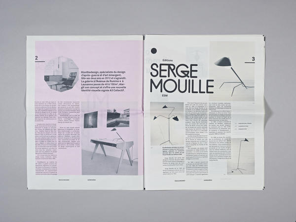
A collector newspaper "Kiss My Newspaper"
has been published to commemorate the opening of the new gallery space.
The newspaper was limited to 100 exemplars and was created to introduce
the concept and the artists of the gallery. The artists participated to
this project with works specially made for the nKISSTHEDESIGN is a
post war furniture and contemporary art gallery. They asked us to do the
new identity based on the old logo. We just had to keep the old logo
colors, pink, black and a rounded typography. we created a new type for
the galery called "KISS ROUNDED". We also made a limited newspaper for
the inauguration of the new gallery space.
Blackboard entry by Yvo Hählen
A Creative Pool project by Yvo Hählen (Switzerland)

website: a3collectif