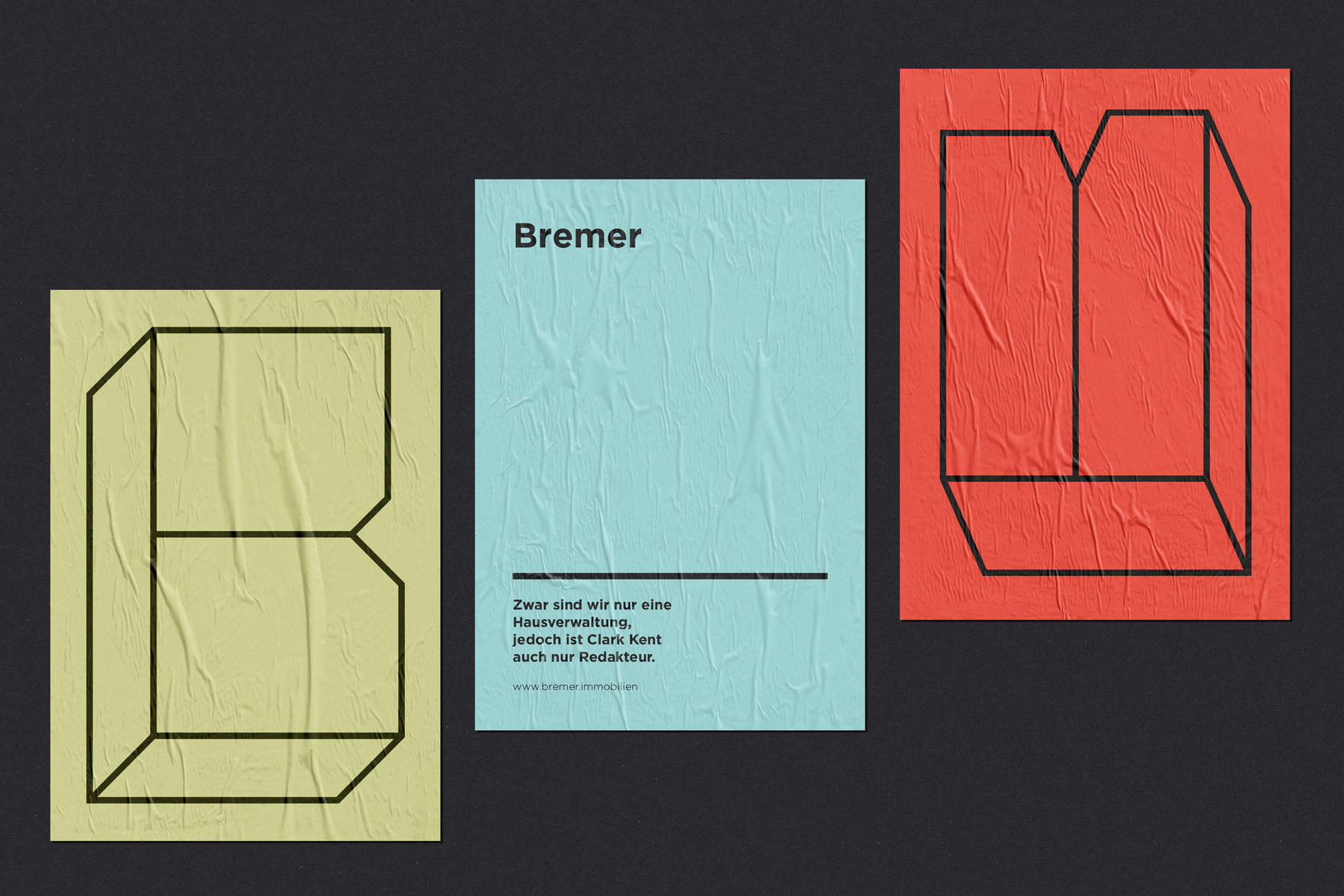
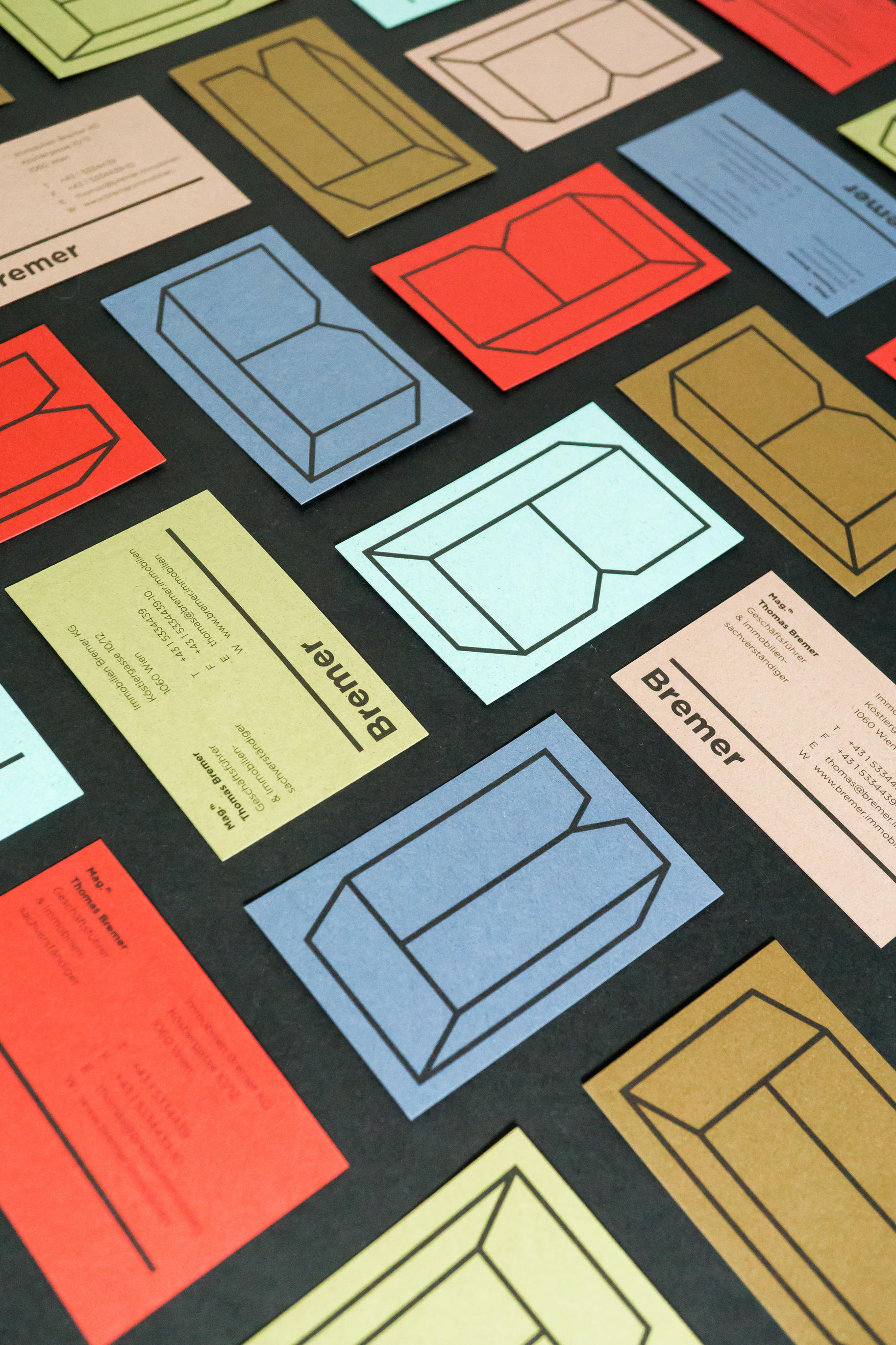
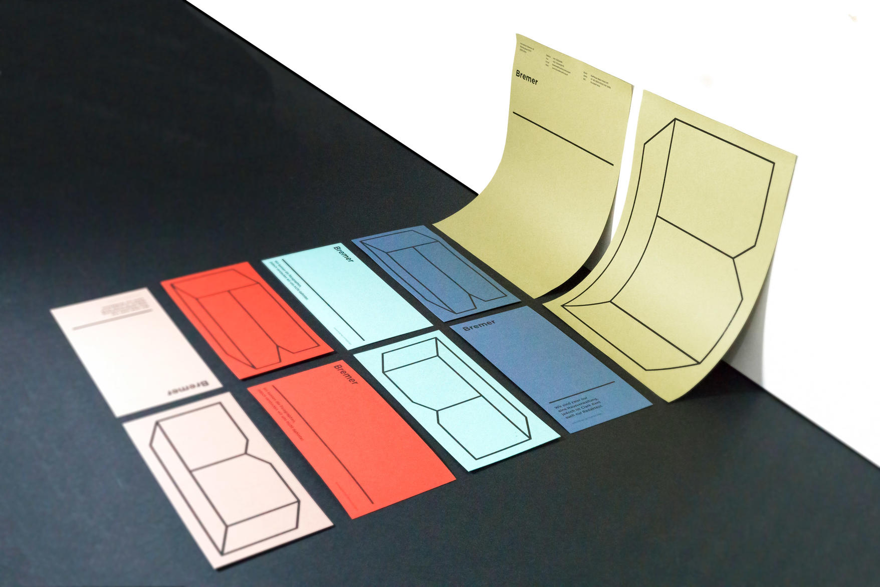
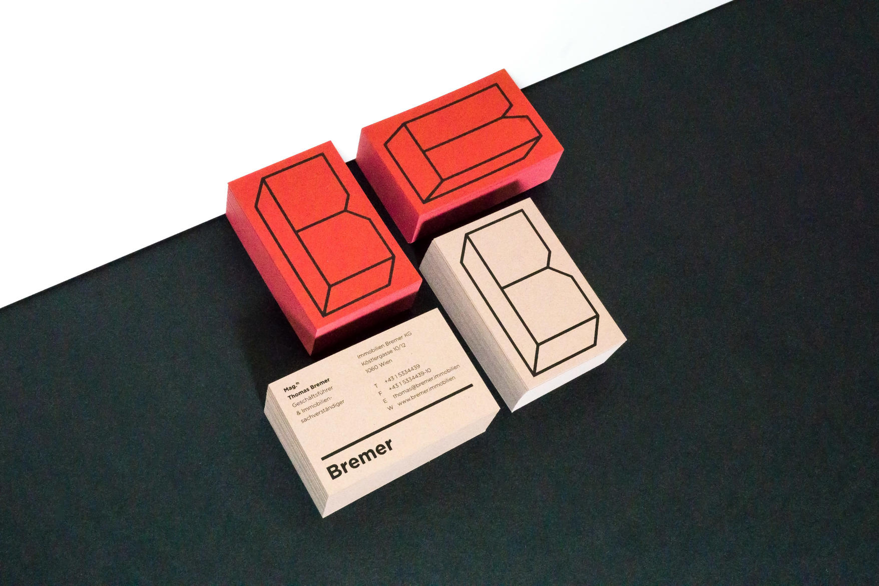
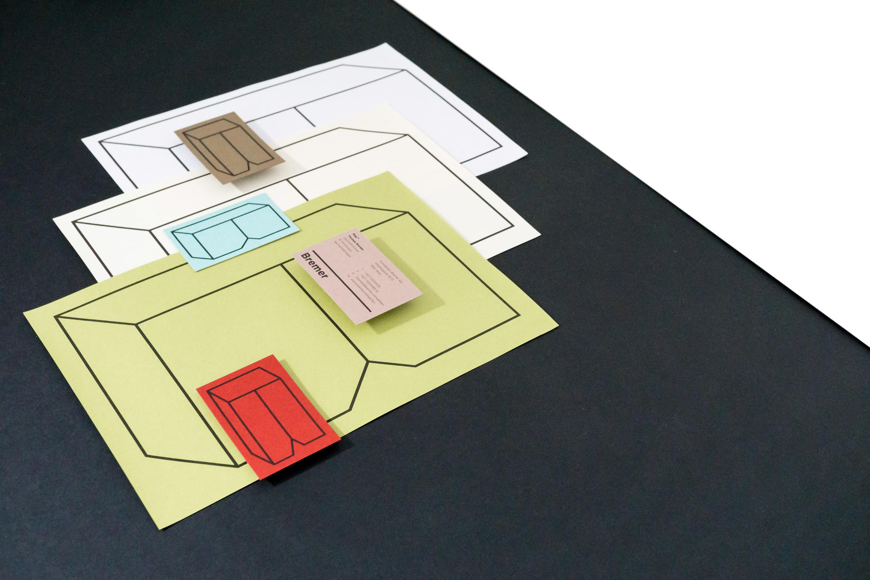
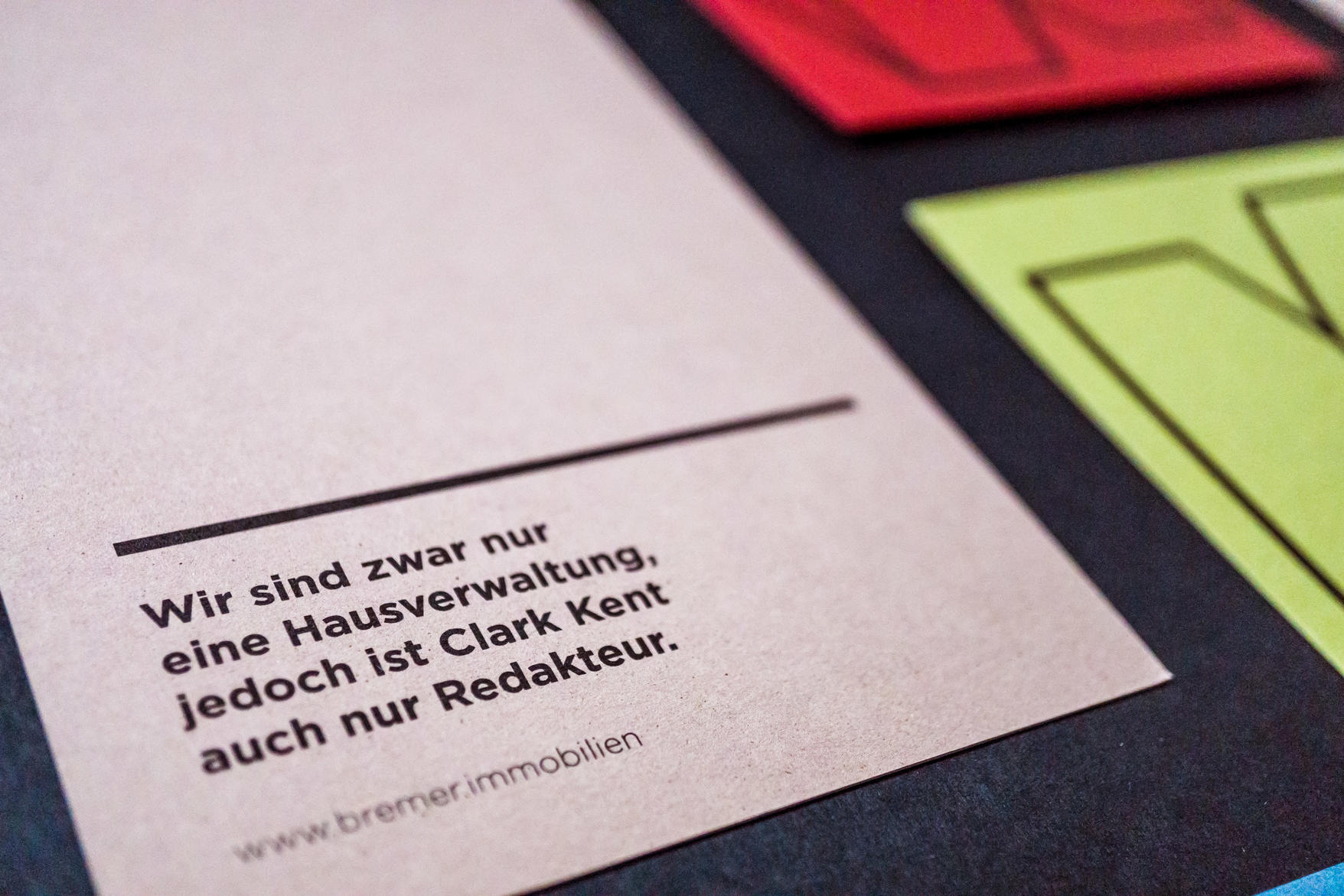
A property management group is something we usually connect with dusty papers and unwanted necessities. "Bremer" as a young, vibrant team needed a structural rebrand to divert from this stereotypical image. To show their flexibility, we created a brandmark that transforms on each canvas to fill it, like "Bremer" fulfill all client's needs. Their joy and diversity is represented in the a colorful print production on paper series "Crush".
website: http://www.kr8bureau.at
