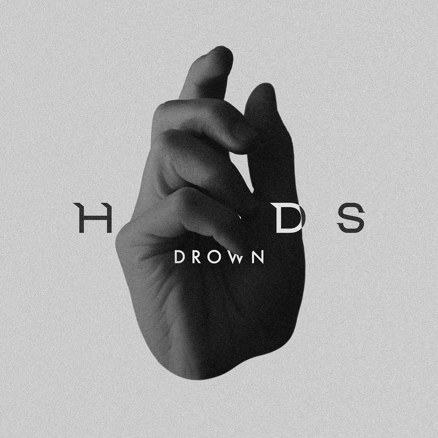
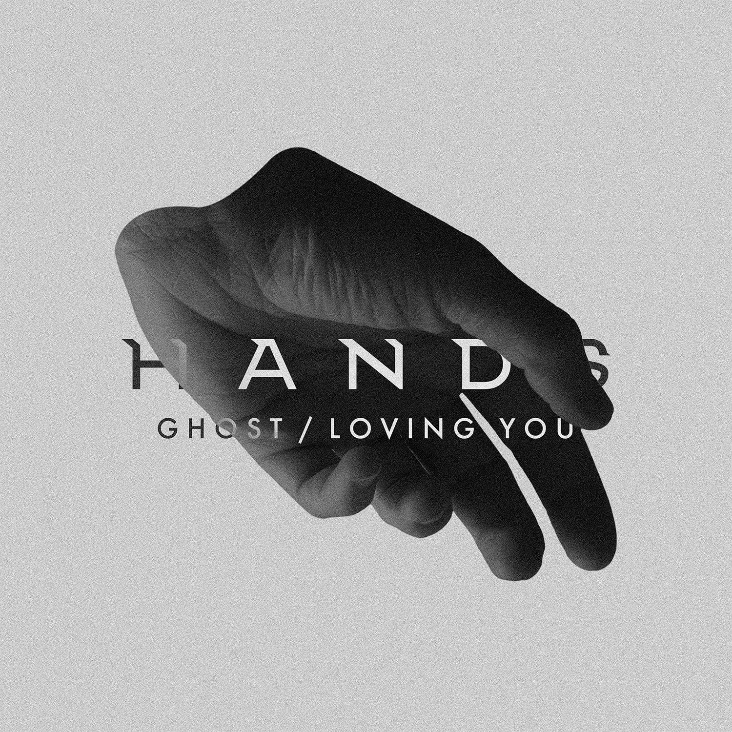
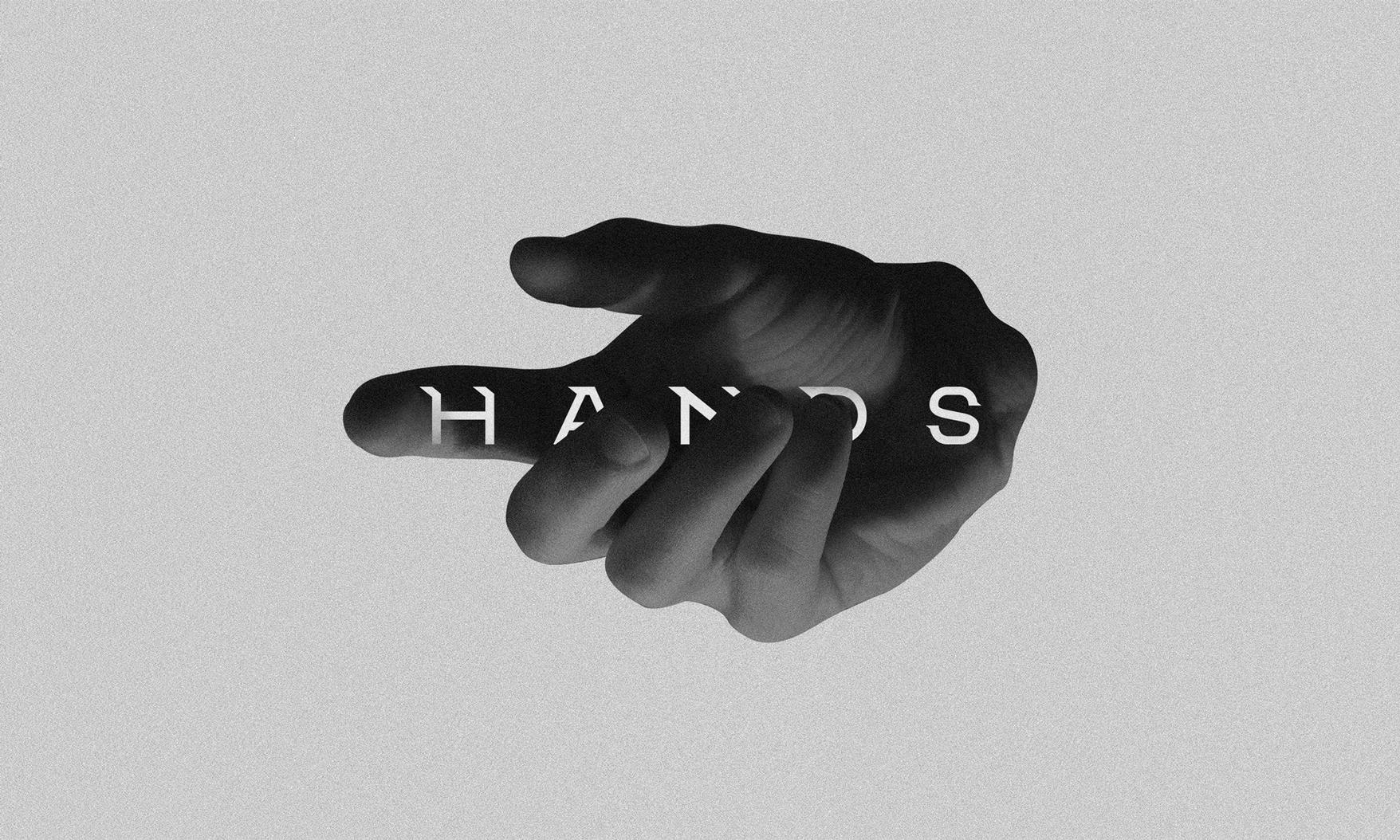
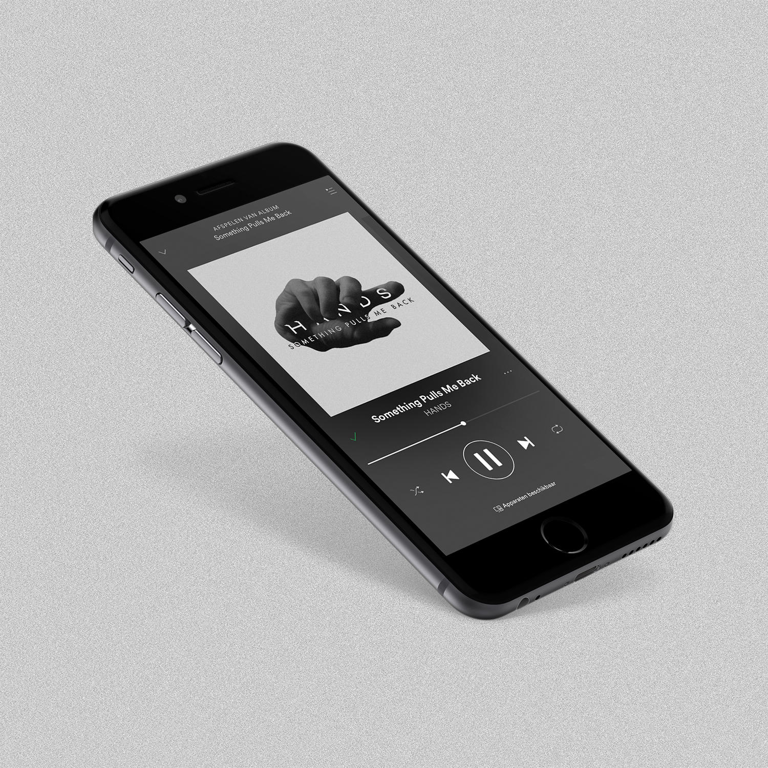
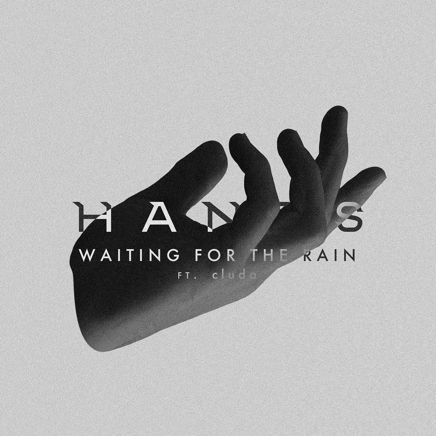
Identity Design Dutch artist HANDS. Inspired by three values: soft, sad, and slow. They encompass the melancholic sounds and lyrics of HANDS as well as the genres that inspire him.
Hands represent the emotion of each song and are ever-changing. The sharp logotype is given a fixed position and brings certainty and balance. The artist is central to every song, but the sound and emotion change.
Studio Lookout is a Dutch design studio.
website: https://www.studiolookout.nl
